
Ink Couple Art
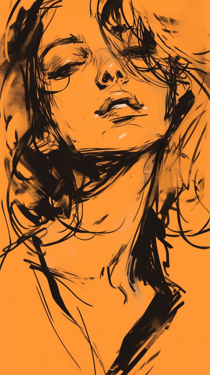
Ink Couple Art transforms an intimate two-person close-up into a vivid orange and black editorial illustration. One reclining figure dominates the center while a second partial face enters from the upper-right, creating emotional proximity through gesture, crop, and expressive linework.
Why Ink Couple Art Creates Stunning Emotional Impact
Ink Couple Art gains power from unusual pose geometry. The central subject tilts backward with closed eyes, elevated chin, softly parted lips, and a long visible neck. The second character leans inward from above, adding warmth and tension without turning the scene into two separate portraits.
Ink Couple Art depends on careful scale. The main face stays large but never becomes a face-only crop. Visible neck, shoulder, upper chest, and lower garment edges preserve the vertical rhythm, while orange negative space around the torso balances the dense black activity near both faces.
A vivid burnt-orange field defines Ink Couple Art and also acts as the unpainted facial base. Black marks describe anatomy, shadow, and expression instead of realistic skin color. Sparse pale accents on the nose, cheek, lips, and chin create small flashes of light with strong graphic value.
The visual language of Ink Couple Art feels fast, raw, and handmade. Thick dry-brush masses sit beside nervous lines, broken contours, cross-hatching, scratch marks, and charcoal-like smudges. Tangled hair strokes and visible sketch corrections keep the image energetic rather than digitally polished.
Composition gives Ink Couple Art its intimate focus. The reclining figure fills the middle and lower canvas, with the head angled left and chin directing attention right. The second person remains partly outside the top-right edge. Unequal scale creates depth and protects the reference-like closeness.
The closed-eye expression is central to Ink Couple Art. Relaxed brows, gentle mouth tension, and quiet facial posture communicate vulnerability without exaggerated drama. The upper-right face angles downward, while overlapping hair and facial marks make the connection immediate and emotionally charged.
Ink Couple Art relies on controlled contrast. Near-black marks cluster around eyes, hair, nostrils, lips, jaw, neck shadow, and garment folds. The orange stays bright and saturated rather than brown or muted. Strong separation keeps rough gesture lines readable and preserves poster intensity.
Creative Styling Details for Ink Couple Art
For a refined result, Ink Couple Art preserves different angles for both characters. The dominant figure uses a reclining low three-quarter view, while the secondary person enters in a tight downward partial profile. Different directions, crops, and scales create a believable visual conversation.
Identity treatment is essential in Ink Couple Art. Facial proportions, eye spacing, brows, nose, lips, jawline, chin, forehead, hairline, and age impression remain recognizable, yet every feature is redrawn in the expressive ink medium. Realistic pasted faces would break the visual unity.
Hair provides movement in Ink Couple Art. Loose strands cross the cheek and neck, heavy black masses frame the upper-left, and tangled marks intensify the overlap near the second face. The goal is controlled chaos that preserves hairstyle identity while translating volume into brush energy.
The clothing in Ink Couple Art stays minimal and abstract. Dark strap-like garment shapes appear near the shoulder and lower chest through angular contours and rough strokes. Sparse lower marks support the pose, protect orange negative space, and make the dense upper region feel more dramatic.
Lighting in Ink Couple Art is graphic rather than photographic. Orange radiance, warm bloom, bright edge separation, and tiny pale shine marks suggest cinematic heat. A few sharp highlights guide attention toward the nose, lips, cheek, and chin without weakening the two-tone design.
When developing Ink Couple Art, avoid extra characters, scenery, logos, typography, flowers, or decorative objects. Two faces, the orange field, black marks, and sparse highlights form a complete visual system. Added elements would distract from facial proximity and weaken the striking simplicity. Ink Couple Art stays focused, and Ink Couple Art keeps the visual hierarchy clear.
The expected result of Ink Couple Art is a saturated vertical illustration with one reclining central figure and one cropped leaning figure. Dense black activity dominates the upper facial region, while calmer orange space supports the neck and torso. Rough texture and controlled crop create editorial impact.
Ink Couple Art turns a close human moment into a graphic study of gesture, connection, and expressive mark-making. Protecting the pose, orange intensity, partial upper-right crop, recognizable identities, and raw brush density produces an intimate image that feels deliberately unfinished and memorable.
[[[ Exact Reference Reconstruction Prompt
Exact Reference Reading
Reference posture: mixed / intimate reclining close-up. The main woman appears reclined or supported backward, proven by the upward-tilted chin, exposed neck, diagonal shoulder line, relaxed head weight, and extreme facial crop. A second person leans downward from the upper-right edge, with only a partial face/head visible, creating intimate face-to-face contact. The composition is an extreme close-up vertical poster, approximately 9:16, with both faces tightly cropped by the canvas edges.
Reconstruct the MAIN REFERENCE as closely as possible with identity replacement only. Preserve the original orange-and-black expressive ink illustration, exact two-person composition, intimate pose geometry, crop, face proximity, overlapping hair, loose sketch density, rough black brushwork, flat orange paper tone, white shine accents, and dramatic graphic contrast. Do not zoom in further. Keep the same reference subject scale, visible neck, shoulder, upper chest, lower clothing edge, and surrounding orange negative space.
Identity Lock
Preserve the uploaded PERSON SOURCE identities with maximum facial and body accuracy. Replace the two reference identities completely with the mapped uploaded people while preserving each person’s real facial proportions, eye shape and spacing, brows, nose shape, lips, jawline, chin, cheek structure, forehead, head shape, hairline, hairstyle identity, beard status, skin-tone relationship, age impression, neck structure, shoulder width, and natural body identity.
Never paste realistic selfie faces onto the artwork. Redraw both identities entirely in the same aggressive black ink sketch language as the MAIN REFERENCE. Adapt each identity to the exact reference head angle, gaze, expression, facial compression, light direction, sketch abstraction, line weight, and orange-black graphic medium.
Character Position Map
Exact character count: 2 people only.
Character 1 — dominant central/lower portrait: largest character, occupying the center, middle-left, middle-center, lower-center, and much of the vertical canvas. Face positioned around the upper-middle area, head tilted backward and slightly toward frame-left. The forehead and hair approach the upper-left crop; cheek and ear sit toward frame-left; chin points toward the center-right. Long neck descends diagonally into the lower-middle composition. One shoulder and upper chest remain visible. Clothing enters from the lower-left and lower-right edges. Preserve the same large scale without enlarging the face.
Character 2 — upper-right partial portrait: smaller secondary person leaning inward from the top-right corner. Only a tightly cropped partial head, hair, forehead/eye region, nose/cheek direction, and surrounding dark sketch marks are visible. The face angles downward toward Character 1. Keep this person partially outside the canvas exactly like the reference. Do not reveal a full body or reposition this person to the center.
Reference Pose Map
1. Central large portrait: extreme close-up reclining pose; head tipped backward; chin elevated; face viewed from a low/front three-quarter angle; eyes fully closed; brows relaxed; lips softly parted; expression quiet, vulnerable, dreamy, and emotionally absorbed. Hair falls around the left side of the face and neck with loose overlapping strands. Neck is elongated by the backward head tilt. Upper chest and shoulder remain visible. Gaze is absent because the eyes are closed. Preserve the exact relaxed facial tension and mouth geometry from the MAIN REFERENCE.
2. Upper-right portrait: intimate leaning pose; head enters diagonally from above-right; face directed downward and inward toward the central woman’s forehead/upper face; very tight partial profile/three-quarter crop; different angle, scale, crop, and head direction from Character 1. Hair and facial contours overlap visually with the central face through dense black sketch strokes. Preserve the exact closeness and emotional proximity of the reference.
Never copy PERSON SOURCE poses. Never make both characters front-facing, upright, camera-facing, equally sized, or separately posed.
Style and Medium Lock
Create a raw expressive editorial ink drawing / fashion illustration / gestural brush sketch on a saturated warm orange field. Use bold black dry-brush strokes, scratchy ink lines, broken contour marks, rapid overlapping gesture lines, heavy shadow masses, loose cross-hatching, irregular line pressure, rough charcoal-like smudges, and unfinished hand-drawn edges.
The artwork must feel spontaneous and emotionally charged, not clean vector art. Preserve the contrast between thick opaque black brush masses and very thin nervous sketch lines. Facial anatomy is readable but selectively unfinished. Use clustered black strokes around eyes, hair, nostrils, lips, jaw, neck shadow, and clothing folds.
Maintain the reference’s simplified two-tone graphic language: vivid burnt-orange / tangerine base, deep near-black ink, and very sparse tiny pale highlight strokes. No realistic full-color skin rendering.
Body, Crop, and Ratio Lock
Exact vertical poster ratio matching MAIN REFERENCE, approximately 9:16. Preserve the narrow canvas and natural reference framing. No extra zoom. No face-only crop. No enlargement of the central head.
Keep the central face at the same scale, with the neck, shoulder, upper chest, and lower garment region visible. Preserve crop points at the top, left, right, and bottom edges. Keep the upper-right person’s partial off-frame placement. Maintain the same orange empty-space balance around the lower neck and torso.
Preserve PERSON SOURCE natural body build and shoulder identity inside the exact reference posture. Do not slim, lengthen, beautify, or modelize the body.
Outfit and Hair Lock
Use only the clothing geometry visible in MAIN REFERENCE: minimal dark garment/strap-like clothing shapes around the lower shoulder and chest area, rendered through rough black brush strokes and loose angular contour lines. Preserve the same garment exposure, drape, edge placement, and abstract ink treatment.
Preserve each PERSON SOURCE hairstyle identity, hairline, volume, and beard status, but translate all hair into the MAIN REFERENCE’s wild black brushwork, tangled line clusters, loose strands, dark ink masses, and gestural strokes. Hair must interact with the composition exactly where the reference places hair.
Scene and Background Lock
Background is a uniform vivid orange paper-like field with subtle analog grain and extremely faint tonal texture. No scenery, room, flowers, architecture, landscape, source-photo background, or decorative objects.
Preserve the orange field as both background and the unpainted skin/facial base of the illustration. Black marks must create the anatomy and depth. Maintain the reference’s dense sketch activity around the upper faces and left hair area, with comparatively calmer orange negative space around the lower torso.
Strong Highlight, Glow, and Contrast Lock
Although this is a graphic ink illustration, preserve the reference’s luminous energy through strong cinematic glow translated into orange radiance, visible warm bloom within the saturated orange field, radiant high-contrast edge separation, luminous facial highlight marks, and soft golden-orange visual heat.
Preserve tiny bright pale highlight strokes on the nose bridge/tip, upper cheek, lips, chin/cheek area, and selected facial planes. These highlights must remain sparse, sharp, and strategically positioned. Keep glossy ink density around the eyes, hair, jaw, and neck shadow.
Use vivid orange saturation, deep black contrast, bright facial highlight accents, clean tonal separation, and rich poster intensity. Never make the orange dull, brown, gray, pastel, faded, muddy, or washed out.
Typography and Text Lock
No text, no name, no caption, no logo, no typography. Preserve the pure illustrated composition.
Density and Texture Lock
Match the original line density: very dense tangled strokes in the top-right overlapping head area; heavy black hair mass along the upper-left and left cheek; dark eye strokes; layered nose and lip marks; strong jaw and neck hatching; scattered loose torso and garment lines toward the bottom.
Retain imperfect brush drag, ink bleed feeling, dry-brush grain, broken lines, accidental-looking overlaps, sketch corrections, and unfinished contour fragments. Do not clean or simplify the drawing.
9-Zone Audit
TL: cropped black hair mass and orange field preserved.
TC: upper head contours and overlapping loose ink strokes preserved.
TR: second person’s partial leaning face/head exactly positioned.
ML: central closed eye, ear, cheek, and hair density preserved.
MC: nose, parted lips, chin, and facial highlights at exact visual focus.
MR: overlapping hair/face strokes and dark edge activity preserved.
BL: shoulder, garment contour, and orange negative space preserved.
BC: elongated neck, upper chest, sparse sketch marks preserved.
BR: dark garment/shoulder brush mass and crop preserved.
Verify exactly 2 characters, exact placement, different pose/view/angle, correct identity mapping, same face proximity, same central subject scale, same crop, same orange background, dense black ink style, vivid color, strong contrast, sparse highlight zones, and no extra zoom.
Bad Output Mistakes
Do not create a realistic photograph, anime art, polished digital painting, clean vector portrait, soft watercolor, 3D render, or generic pencil sketch. Do not zoom into the central face. Do not remove the neck or lower torso area. Do not center the second person. Do not show the second person’s full face or body. Do not separate the characters. Do not change the intimate head proximity. Do not open the central person’s eyes. Do not copy PERSON SOURCE expressions or poses. Do not weaken the black line density. Do not replace vivid orange with beige, brown, yellow, red, or gray. Do not smooth the rough brushwork. Do not simplify tangled hair strokes. Do not add text.
Negative Prompt
wrong count, wrong position, same pose/view/angle repeated, copied source pose, missing character, extra character, shifted character, duplicated character, merged identities, weak glow, missing bloom/rim light, flat lighting, dull colors, faded colors, muddy colors, low contrast, missing highlights, wrong face, identity mismatch, pasted selfie face, weak resemblance, wrong body,
slimmer body, model-like body, wrong ratio, wrong crop, excessive zoom, face too large, missing neck, missing shoulder, missing torso, source clothes, source background, realistic photo, anime, clean vector, polished digital painting, soft watercolor, weak ink lines, simplified style, smooth line art, wrong hands, wrong fingers, bad anatomy, wrong typography, wrong name, unwanted text, missing details, low density, plastic skin, blurry face, watermark, logo, AI artifacts. ]]]
Prompt Features Explanation:
Ink Couple Art presents a highly expressive editorial illustration that explores emotional closeness through bold ink techniques and dramatic visual storytelling. The concept revolves around two people placed within a carefully balanced vertical composition where intimacy is communicated through posture, composition, facial direction, and energetic brushwork rather than complex scenery or decorative elements. Every visual decision contributes to creating a memorable artistic experience that feels spontaneous, handcrafted, and emotionally authentic.
The composition immediately draws attention to the dominant reclining figure positioned at the center of the artwork. This individual occupies most of the available space while maintaining enough surrounding negative space to preserve visual balance. The large central portrait establishes emotional focus and creates a strong foundation for the entire composition.
A second person enters only partially from the upper-right corner. Rather than presenting two equal portraits, the artwork intentionally reveals only a portion of the secondary face. This unequal scale creates depth and naturally suggests closeness without requiring physical interaction beyond gentle facial proximity. The cropped placement strengthens the emotional connection while keeping the composition visually dynamic.
Facial expression plays a significant role throughout the concept. The reclining subject keeps both eyes softly closed while the chin lifts naturally upward, exposing the neck and creating graceful body lines. Relaxed eyebrows, gently parted lips, and calm facial muscles communicate quiet vulnerability, peaceful reflection, and emotional warmth. The secondary figure leans inward with subtle intention, creating a silent conversation between the two characters.
Body positioning contributes greatly to the storytelling. Instead of standing or sitting upright, the main figure appears comfortably supported in a reclining position. This posture produces elegant diagonal lines extending from the face through the neck toward the shoulder and upper chest. The second figure approaches from above, establishing contrasting movement that enriches the overall visual rhythm.
The artistic style is intentionally raw and expressive. Thick black brush strokes combine with loose sketch lines, irregular contours, scratch marks, cross-hatching, charcoal-inspired textures, and visible corrections to create the impression of handmade craftsmanship. Rather than appearing overly polished, every mark celebrates artistic spontaneity while maintaining recognizable anatomy.
Color design remains remarkably simple yet visually powerful. A saturated burnt-orange background forms both the environment and the unpainted facial base. Black ink defines every major anatomical feature including the eyes, nose, lips, jawline, neck, hair, garments, and shadows. This limited color palette allows the artwork to achieve exceptional visual impact through contrast rather than complexity.
Hair becomes an important source of movement throughout the illustration. Flowing strands overlap facial contours, extend across the composition, and merge naturally with darker brush masses. Individual hairstyles remain recognizable while adopting expressive ink treatment that emphasizes energy and rhythm.
Lighting follows a graphic rather than photographic approach. Small pale highlights appear selectively along the nose, lips, cheekbones, chin, and facial contours. These restrained highlights introduce subtle dimensionality while preserving the strong two-tone aesthetic that defines the overall illustration.
Minimal clothing allows the composition to remain focused on gesture and expression. Dark strap-like garment shapes appear around the shoulders and upper chest through rough angular strokes. Their simplified presentation supports the overall composition without distracting from the emotional relationship between the two figures.
Negative space plays an equally valuable role. Large areas of uninterrupted orange balance the dense brush activity surrounding the faces. This thoughtful distribution prevents visual overload while emphasizing facial proximity and emotional interaction.
Texture density varies intentionally throughout the artwork. Hair, facial shadows, garment edges, and overlapping contours contain rich layers of energetic marks, while calmer regions surrounding the neck and torso provide visual breathing room. This contrast guides the viewer naturally toward the most emotionally significant areas.
Composition follows a deliberate hierarchy. The central reclining figure serves as the unmistakable focal point, while the secondary figure enhances emotional context through partial visibility. Their differing scale, angle, and placement prevent visual competition and reinforce narrative depth.
The editorial character of the artwork makes it suitable for magazine-inspired illustration, artistic branding, gallery prints, contemporary posters, creative portfolios, visual storytelling, book covers, music artwork, fashion editorials, and expressive decorative wall displays. Its bold graphic language allows it to stand confidently within both modern and classic artistic settings.
Overall, Ink Couple Art combines emotional intimacy, expressive brushwork, simplified color design, thoughtful composition, dynamic texture, and handcrafted illustration techniques into a visually striking concept. Every component works together to produce a memorable artistic experience where gesture, connection, and expressive mark-making become the true focus of the visual narrative.
Internal Link:
“https://prompt.mahantababu.com/“
External DoFollow Link:
“https://en.wikipedia.org/wiki/Artificial_intelligence“
Incoming Link:
“https://prompt.mahantababu.com/ink-couple-art/“